This is going to be a short post, because I’m very tired.
Status report: By the time I go to sleep tonight, I will have finished the second section and half of the third section of Chapter 2. That means one more half-section to go. It will be the hardest half-section to revise, but I tell myself that it’s only ten pages (singled spaced, not counting footnotes, but still). It’s on The Picture of Dorian Gray and “The Soul of Man under Socialism,” by Oscar Wilde.
Today, I revised and revised, and the only fun thing I did was take a half-hour to go to the fabric store and buy a half-yard of two fabric patterns. (I keep using the world half in this post. I think that’s because I’m living a half-life.)
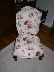
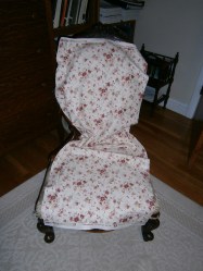
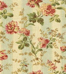
I thought that if I was going to invest in reupholstering a chair, I wanted to be absolutely sure I knew what it would look like. Buying half-yards of each pattern would allow me to put them on the chair itself, see them under the correct lighting. I actually didn’t realize that lighting would make such a difference: they looked much brighter, brasher, under the lights in the fabric store. I liked them so much better when I had taken them home and draped them over the chair.
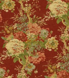
Tell me what you think. This one is Norfolk Rose:
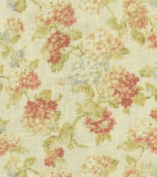
And this one is Fairhaven:
I think I like Norfolk Rose best, for this particular chair. The nice thing about having half-yards is that I can use the fabric for making pillows. Not that I have time right now. But eventually I’ll have time, and I’ll be able to make pillows with roses and morning-glories on them. (Fairhaven actually has morning-glories on it, in colors that work with Norfolk Rose). These particular patterns have been around for a long time, and I don’t think they’re going anywhere. And they work with all the other patterns I love – the colors talk to each other. Patterns should talk to each other, they should speak the same language; they should never actually match.
Like these:
Because, you know, I’m not Diana Vreeland:
While I’m working on my dissertation, I sometimes look at the Apartment Therapy blog to cheer myself up. That’s where I saw the picture above, of Vreeland’s famous red living room. And then, just as I had done with Coco Chanel, I started collecting quotations from her.
“You gotta have style. It helps you get up in the morning.”
“The only real elegance is in the mind; if you’ve got that, the rest really comes from it.”
“Elegance is innate. It has nothing to do with being well dressed. Elegance is refusal.”
“The two greatest mannequins of the century were Gertrude Stein and Edith Sitwell – unquestionably. You just couldn’t take a bad picture of those two old girls.”
“The best thing about London is Paris.”
“I loathe narcissism, but I approve of vanity.”
“I’m terrible on facts. But I always have an idea. If you have an idea, you’re well ahead.”
“Without emotion there is no beauty.”
“Never fear being vulgar, just boring.”
“What do I think about the way most people dress? Most people are not something one thinks about.”
That sounds rather narcissistic, doesn’t it? But when you’re an artist, you have to not think about most people – what they want, what they like. Unless you’re the most commercial of artists, trying to please the public taste, not trying to do anything more than that. But if you have an individual vision, you need to concentrate on what you want to create. You need to ignore the public.
“I think your imagination is your reality.”
I think I like Diana Vreeland. But this one is my absolute favorite:
“The idea of beauty was changing. If you had a bump on your nose, it made no difference so long as you had a marvellous body and a good carriage. You held your head high and were a beauty . . . You knew how to water-ski, and how to take a jet plane in the morning, arrive anywhere and be anyone when you got off.”
If I could take a jet plane in the morning, I think I would get off in Paris . . .



Oooo. I like the bigger print *very* much.
I like the Normandy Rose!
Oops, sorry Caitlyn, it’s actually Norfolk Rose. I just corrected it. Yes, I like that one (the bigger print) better for the chair too!